The Challenge
Facing two major challenges—a national decline in synagogue membership and the departure of both rabbis—we launched a proactive membership campaign to reach those searching for a new spiritual home.
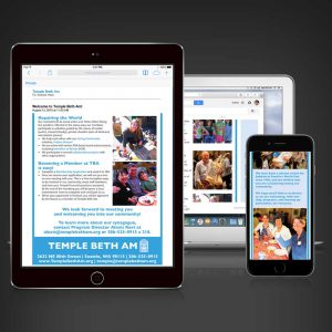
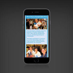
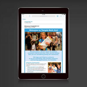
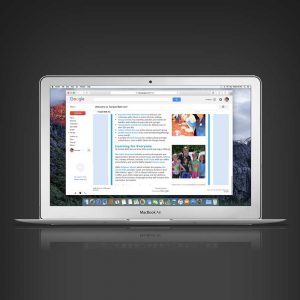
I led the creative for a targeted email and ad campaign timed for the High Holy Days, using demographic targeting via Facebook and Google Ads. The campaign featured real members (not stock photos), warm visuals of families, and links to key programs like our award-winning religious school.
I designed responsive emails with engaging visuals and wrote copy focused on community and connection. The result? Membership increased when it was expected to drop—our highest growth year on record.
What I Did:
- Art Direction
- Branding
- Project Management
- Research
- Wireframes
- UX
- Graphic Design
- Responsive Design
- Copywriting
- Editing
- Email Coding
- Email Testing
Project Type:
Email Design & Implementation
Programs Used:
- Photoshop
- Constant Contact
- HTML/CSS


